Seven images for one product page

I wanted X-All’s product galleries to do more of the explaining.
I’d been looking at Primal Queen’s product page, where the images gave me a reason to keep moving through the gallery. A large headline, a product shot, a diagram: each image could develop another part of the story. I liked the color and texture, too. I sent the page to Codex and asked it to look before making anything, then ask me questions.
We were going to try this for X-All, the cleaning brand I work on. I’d already been making complete static ads in Codex. Now I wanted to see whether it could make six to eight images that worked together on a product page. If the first set worked, we could take the process through the other products and eventually the kits.
A bottle and a pouch
Codex asked what I wanted from the reference: the whole page or the gallery artwork, which parts of the style, and which product to start with. We settled on an educational sequence with colorful, textured artwork, using X-All’s own packaging and colors.
Multi-Purpose Spray came first. We had a photograph of a bottle beside a pouch of cleaning tablets. That pairing gave the gallery something to explain. What arrives? How do the tablets become a spray? What do you keep, and what do you buy again?
Codex proposed seven images: an introduction, the cleaning benefit, kitchen surfaces, instructions, refills, packaging details, and purchase options. It worked out the copy and the source for each before generating the artwork.
The first image put the bottle and pouch beneath an enormous white headline. Saturated blue filled the background, with gold bands running diagonally behind the product. It gave us a direction we could carry into the rest of the set.
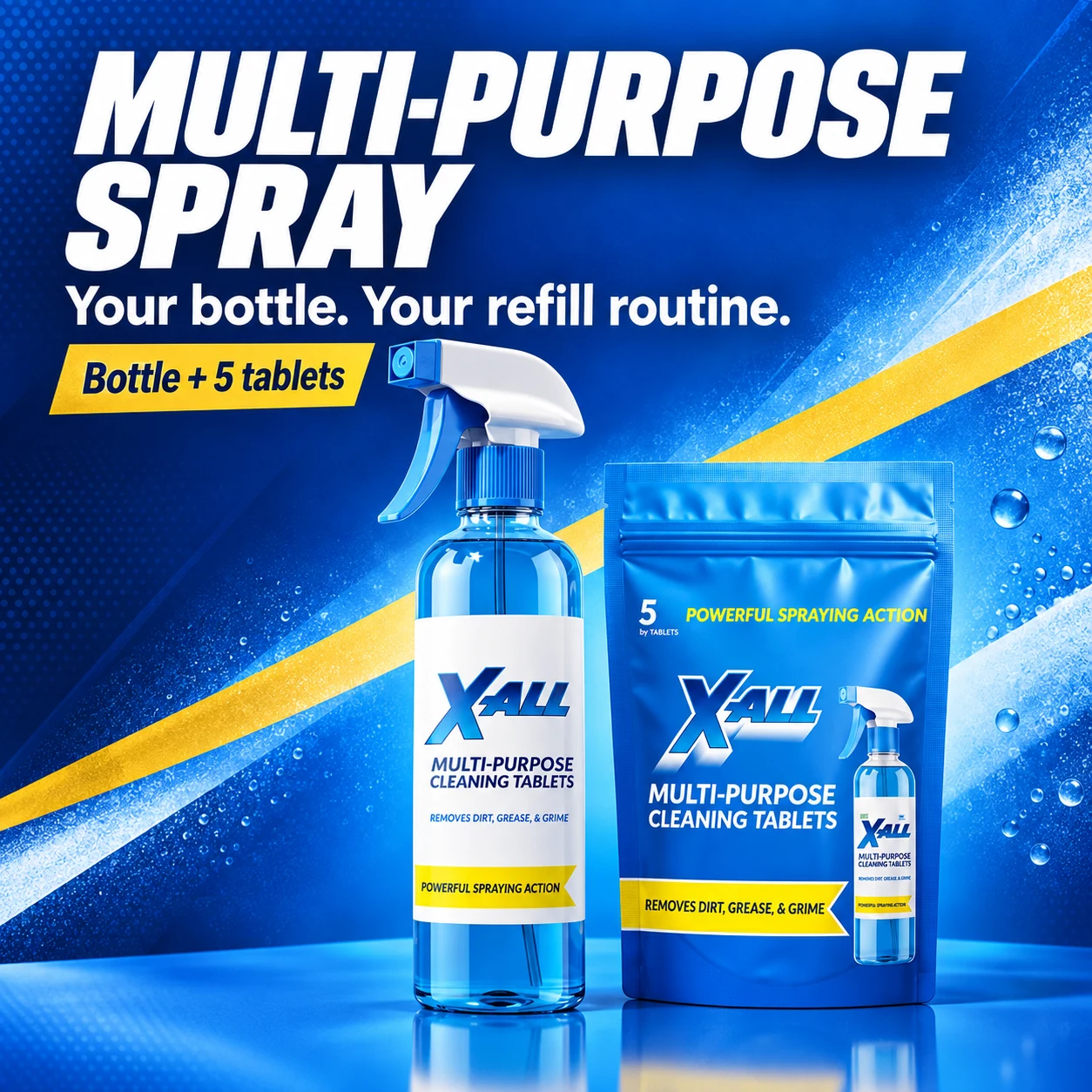
Seven images that belonged together
For the next images, Codex kept two references in play: the original product photograph for appearance, and the first generated image for style.
The layouts changed with what they needed to explain. Three kitchen surfaces became three angled picture windows. Four instruction steps became a pale-blue diagram. The refill image turned the background yellow and used arrows to connect the bottle and pouch. The type, colors, and textures held the set together while the compositions changed.
That variety was part of what I liked about it. We had gone from one photograph to a gallery that could show a product, illustrate where it belonged, and explain the refill format.
There were details to work through. The applications image needed more room around its headline and captions, so Codex revised the typography and margins. Small packaging text drifted as the product was redrawn. The tiny bottle printed on the pouch was particularly easy to get wrong: a picture of the product inside another picture of the product, with its own miniature label.
The viewer below contains the seven images from that first pass, including the ones we later decided to rethink.
The first seven images
The first set, with notes from the review. These are generated concepts; the product details and instructions still needed checking.
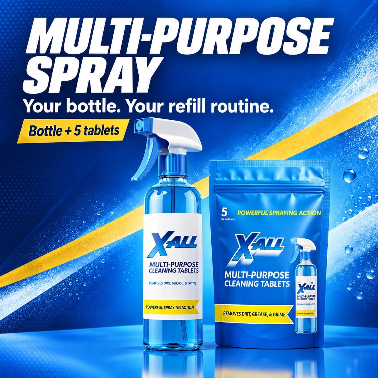
The first image established the white headline, cobalt background, gold accents, and prominent product group.
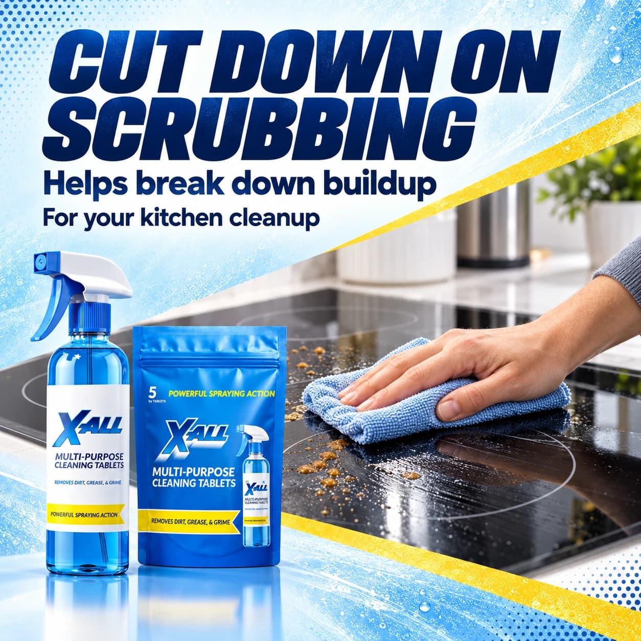
The second image connects the product to kitchen cleanup. This is a generated scene, not a demonstration of cleaning performance.
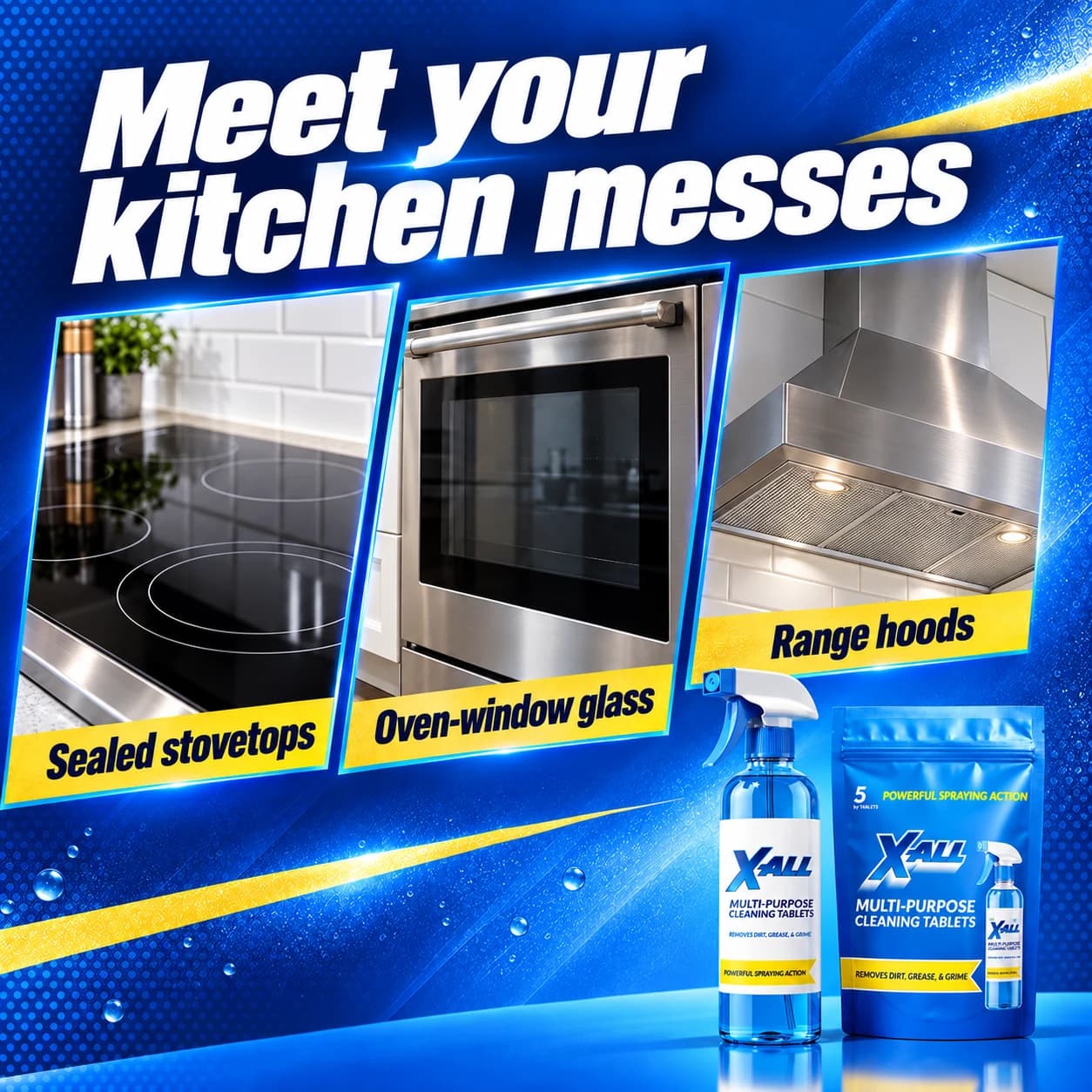
The applications slide gives one image to each of the three kitchen surfaces selected for the brief.
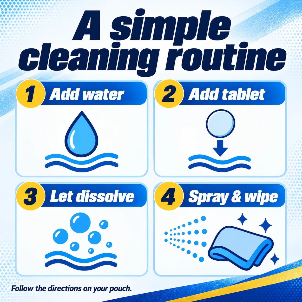
The provisional instructions from the first pass. Review later found that Spray and wipe left out the contact-time step described elsewhere on the page.
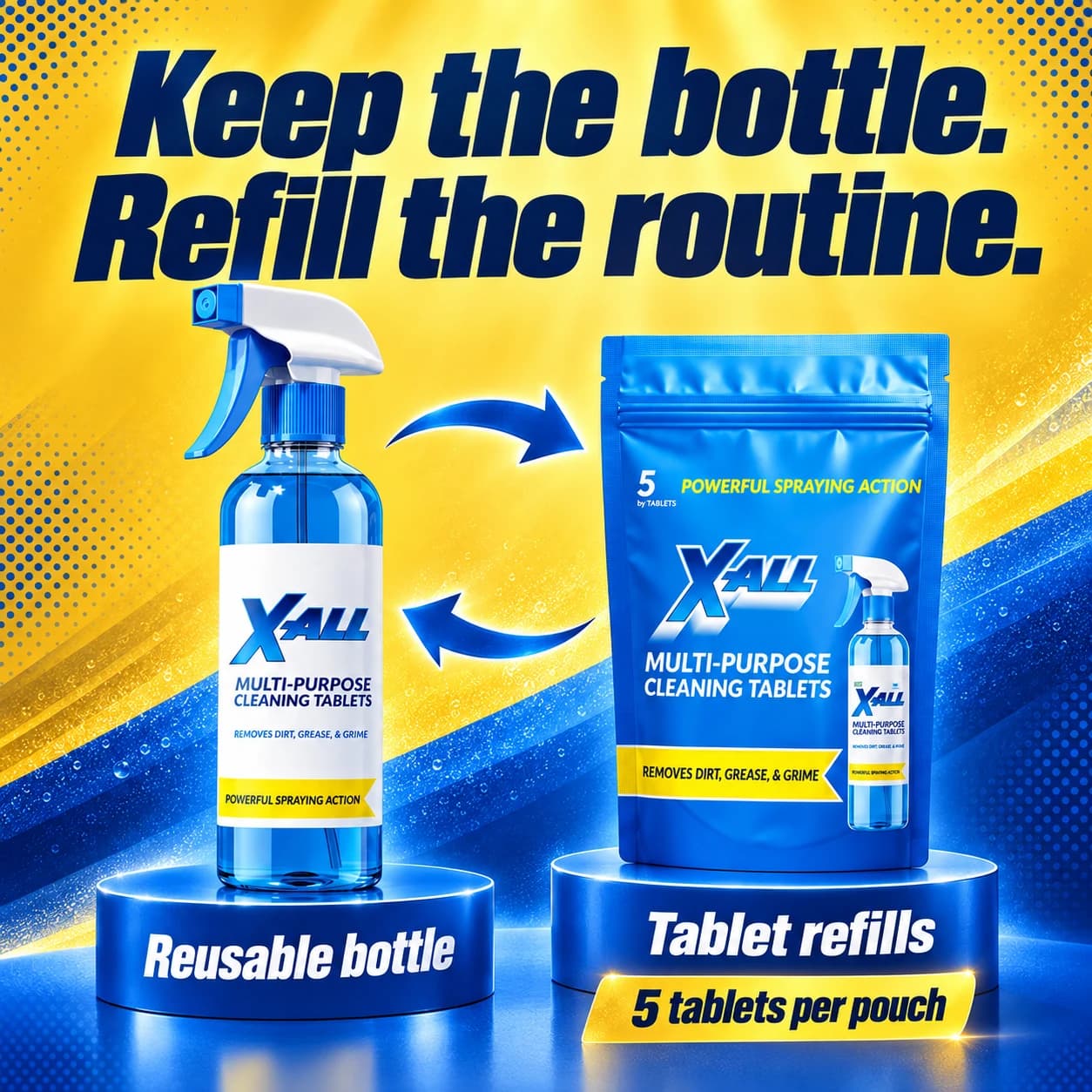
The yellow background changes the pace while the bottle, pouch, type, and textures keep the image connected to the set.
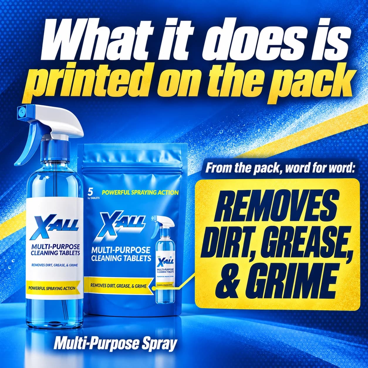
This slide drew from the packaging. In review, we decided the space would be more useful for actual customer proof.
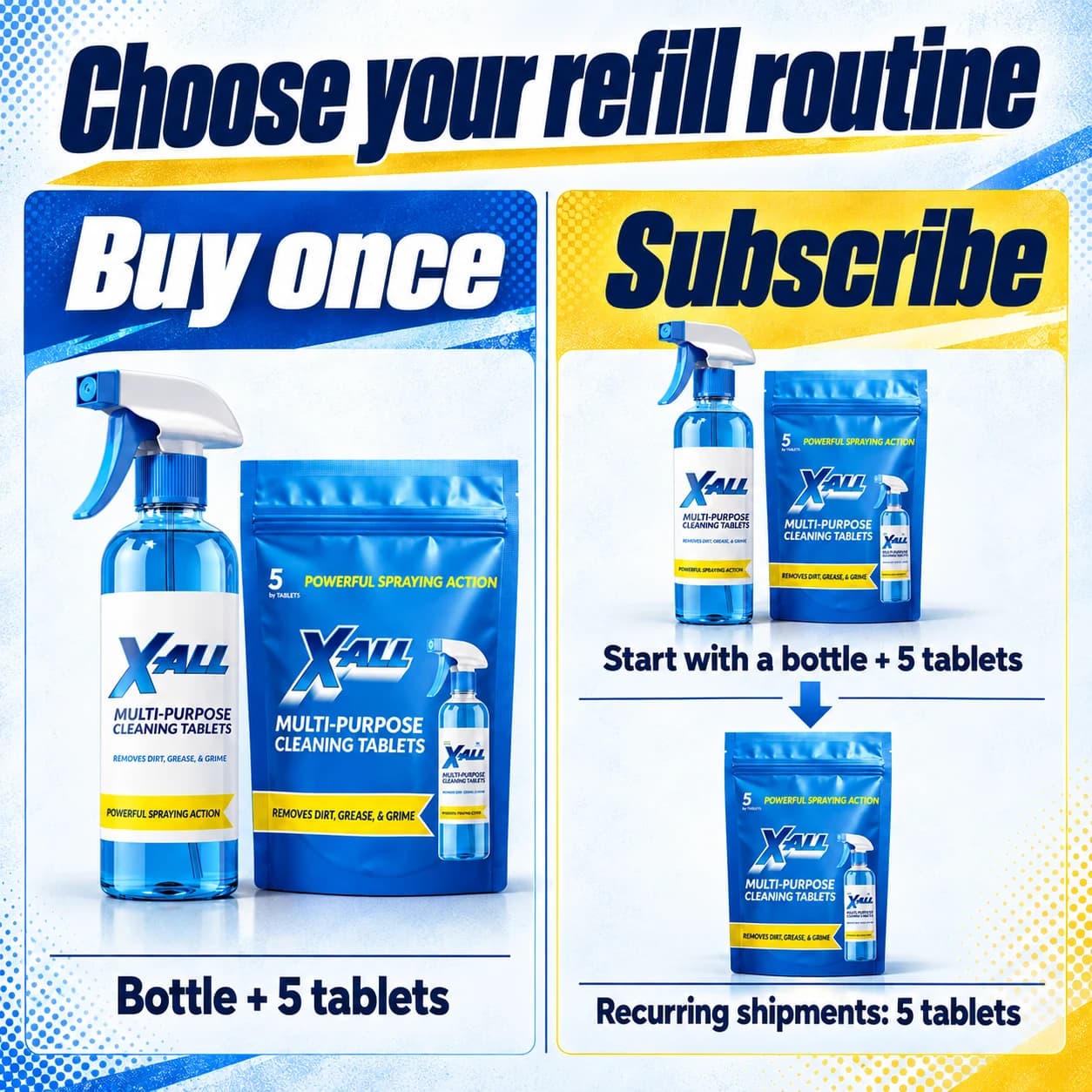
The final concept explains what comes with the initial order and what arrives as a refill, without adding prices or a delivery schedule.
“These are fantastic,” I told Codex. I asked it to put them on the store.
Seeing them on the page
Once they were in place, I wanted the original product photograph first. It was the clearest view of what someone would receive. But that changed the opening of the gallery: the photograph introduced the bottle and pouch, then the generated image introduced them again. The second image could have been showing what the product helped someone do.
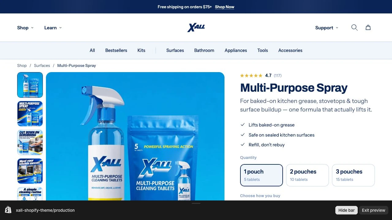
I asked Codex whether the setup was likely to help conversion and what it would improve. It found a more basic problem. Eight images were attached to the product, but the theme only showed six. The original photograph and seven new images were all there in the store’s records. A shopper couldn’t reach the last two.
Then we looked at the instructions.
I hadn’t supplied verified mixing directions. When Codex asked, I told it to assume defaults. It avoided specific amounts and timings and made a four-step diagram: add water, add a tablet, let it dissolve, then “Spray & wipe.”
Elsewhere on the product page, the written instructions told the customer to wait before wiping. Our diagram had compressed that into a single action. Leaving out a number hadn’t made the instructions neutral; the image was still telling someone how to use the product.
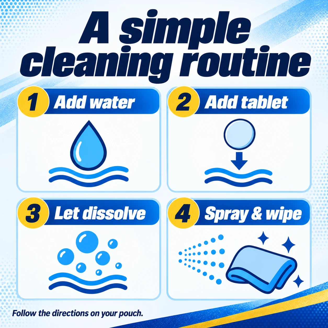
That needed the actual product directions. We also had a packaging-details image that enlarged claims from a package we were already showing. I wanted to use that space for something a customer hadn’t seen yet, such as a real demonstration or a specific review, once we had the material.
I asked for a revised sequence: the original photograph, then the main benefit or a demonstration, followed by suitable surfaces, verified instructions, contents and refills, customer proof, and purchase options. The artwork gave us plenty to work with. Seeing it on the page made the decisions more specific: what should come next, what repeated, and what was missing.
I still want to test whether the gallery helps more people buy. For now, I have a first set I’m excited about and a clearer idea of how to revise it. The part I want to carry to the next product is making the images and reviewing the page as one continuous piece of work.
Try it with your product
I’ve packaged the process as a reusable skill, with a blank product brief and a starting prompt. It covers the sequence, visual direction, image generation, and review on the page.
Download the gallery skillRead the instructions
Unzip the folder, fill in the brief with your product facts, and attach it alongside SKILL.md and your product photographs to an agent with image generation available. The download contains the instructions; bring your own brand assets.
For a quick first pass, attach a product photograph, verified facts, and a gallery reference, then use this prompt:
Create a six-to-eight-image product gallery using the attached photo, facts, and visual reference. Give each image a distinct job, and ask about missing facts.

Make one image to establish the style, then build the set. Check product accuracy and readability, and review the images in order on the page.