Notesgoogle-flow-reference-led-product-imagery
I gave Google Flow two references and told it to go wild
Two references gave Google Flow the visual direction. Real X-All product photos gave it the subject. Packaging QA and final edits still need a human.
 · Jul 2026
I attached two reference images to Google Flow and asked one boring question.
How would you describe these from a lighting and composition point of view?
In the same prompt, I told it I wanted that visual language for X-All. The agent came back with hard lighting, frozen motion, and a polished studio-still look, then asked what X-All sold. I uploaded real product photos and said, more or less, go wild.
It did.
The workflow at a glance
- Pick two reference images because their lighting and composition feel right.
- Ask the Flow agent to describe what those images are doing visually, and tell it you want that direction for the brand.
- Add real product photos in the same conversation.
- Let the agent explore, then inspect packaging, labels, and colors before anything ships.
The style references set the visual direction. The product photos gave Flow the actual products to work with.
The first prompt didn't ask for an image
The first prompt wasn't "make a premium product shot." It was a request to describe two images I already liked. The references carried the taste, and Flow turned them into a small visual brief.
The agent's back-and-forth is the useful part. Instead of treating every prompt as a one-off, I could keep the direction in the conversation and let the next answer build on the last one.
Then the gallery started wandering
The first useful surprise was how far the agent moved beyond a literal product-on-a-table shot. It built action scenes around the toilet-cleaning foam powder, tried a bubbly version of the X-All logo, froze tablets against water, and turned a stack of cleaning products into a whole blue visual system.
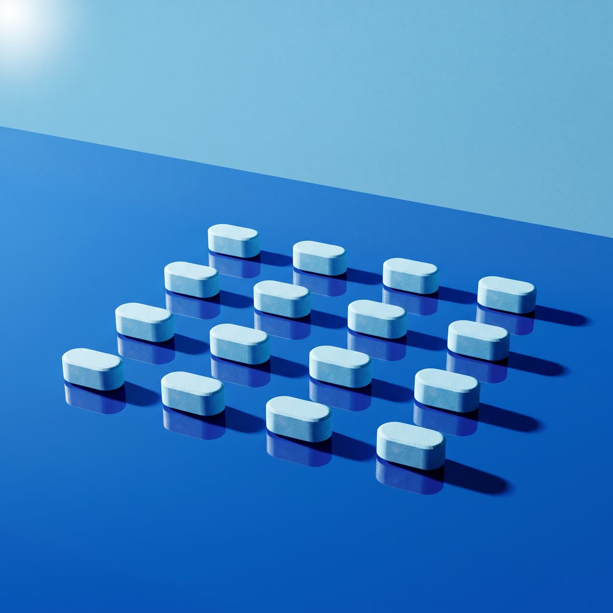
I hadn't asked for the bubbly logo or any of those exact compositions. The references gave it a lane. "Go wild" gave it room to move inside it.
Some images looked usable out of the box. The microfiber cloth shot looked sharp. The tablet dissolving inside the bottle did, too.
The label is where the illusion breaks
The single-product shots held together better than the more complicated compositions. Once several products appeared in the same image, labels started drifting. A package could look right from across the room while saying the wrong thing up close. Some colors moved, too.
That's not a tiny production detail. A beautiful product image with the wrong label is still the wrong product image.
The remaining outputs needed either a normal editing pass or a different job. Some were direction, not deliverables. Even those gave me lighting, motion, surfaces, and compositions I could react to.
Pretty dang good for finding a direction
Flow was strong at reading references, carrying a visual language across products, and generating concepts I hadn't thought to request. Packaging QA, color correction, and the final call on what could ship still belonged to me.
For getting an actual design direction in place, it was pretty dang good.
The whole thing started with two images and one boring question.
Want the next build when it ships?
Occasional emails about systems like this one — how they work, and the parts you can reuse in your own work.
Get emails from the workshop →New notes, skills, and connectors as they ship. No spam.